Flex Boxes
Basisstappen om Flexbox te gebruiken
- Voeg
display: flex;toe aan de container. - Gebruik eigenschappen zoals:
justify-content: Hiermee regel je hoe de items horizontaal worden uitgelijnd. Bijvoorbeeld:justify-content: center;zet de items in het midden.align-items: Dit regelt de verticale uitlijning van de items.flex-wrap: Hiermee kun je ervoor zorgen dat de items naar een volgende rij gaan als er te weinig ruimte is.
.container {
    display: flex;
    justify-content: center;
    align-items: center;
}

.item {
    width: 100px;
    height: 100px;
    background-color: lightblue;
    margin: 10px;
}
flex-basis
Stel, je wilt dat een container de hele breedte van de pagina in beslag neemt dan pas je het item aan
.container {
    display: flex;
}

.item {
    flex-basis: 100%;
}
More on: https://css-tricks.com/snippets/css/a-guide-to-flexbox/
Basis structuur
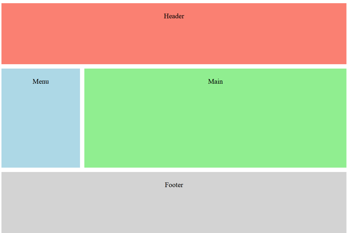
<html>
<head>
    <style>

        .container {
            display: flex;
            flex-direction: column;
            height: 98vh;
        }

        .header {
            background-color: salmon;
            flex: 0 0 100px;
            text-align: center;
            padding: 20px;
        }

        .content {
            display: flex;
            flex: 1;
        }

        .menu {
            background-color: lightblue;
            flex: 1;
            padding: 20px;
            text-align: center;
            margin: 10 10 10 0;
        }

        .main {
            background-color: lightgreen;
            flex: 4;
            padding: 20px;
            text-align: center;
            margin: 10 0 10 0;
        }

        .footer {
            background-color: lightgray;
            flex: 0 0 100px;
            text-align: center;
            padding: 20px;
        }
    </style>
</head>
<body>
    <div class="container">
        <div class="header">Header</div>
        <div class="content">
            <div class="menu">Menu</div>
            <div class="main">Main</div>
        </div>
        <div class="footer">Footer</div>
    </div>
</body>
</html>
flex: 0 0 100px;
- The item will not grow (
flex-grow: 0). - The item will not shrink (
flex-shrink: 0). - The item has a fixed size of 100 pixels (
flex-basis: 100px).
xx